
Flux AI — Premium SaaS & AI Website Template
A 14+ page dark-mode Framer template built for AI tools, automation platforms, and workflow-driven SaaS products.
Framer
Template Design
UI/UX
Figma
SaaS
Dark Mode
CMS
Overview
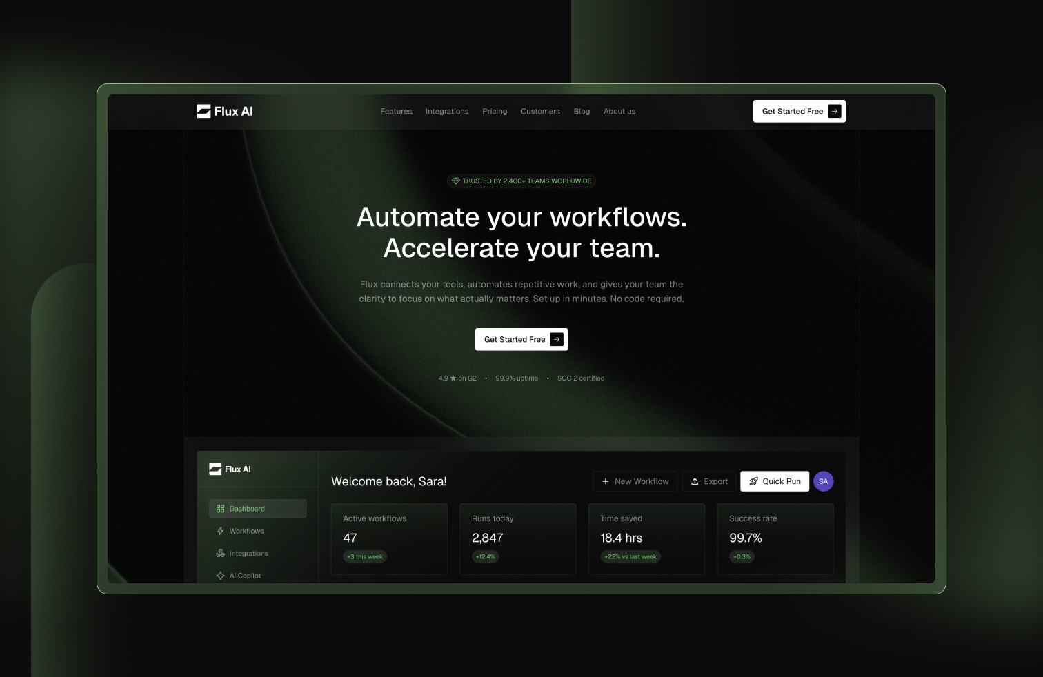
Flux AI is a premium Framer website template designed for teams launching AI tools, workflow automation platforms, and B2B SaaS products. It features 14+ fully designed pages, 3 CMS collections pre-loaded with real content, and 9+ custom product UI mockups — all built from scratch in Figma and Framer.
The goal was simple: build the template I wished existed. One that looks like a $50K agency build, not a template. One with real content on every page, not lorem ipsum. One that a founder could buy at 9am and have a credible SaaS website live by lunch.
The problem
Most SaaS templates on the market fall into two categories. Generic single-page templates with placeholder text that require weeks of customization. Or over-designed multi-page templates that look impressive in the preview but fall apart when you try to swap in real content.
Founders and product teams launching SaaS products need a third option — a complete marketing website with real content structure, CMS-powered dynamic pages, and a design language that communicates credibility from the first visit.
MY ROLE
Solo designer and developer. I handled everything — market research, competitive analysis, design direction, content strategy, copywriting, Figma mockups, Framer build, CMS architecture, and marketplace submission.
What I built
14+ pages
Every page serves a specific purpose in the buyer's journey — from awareness to consideration to decision.
Homepage — 12 sections including hero with product dashboard screenshot, social proof logo bar, problem/solution narrative, 6 feature cards with custom UI mockups, 2 deep-dive showcase sections, testimonials with real metrics, integrations preview, pricing with monthly/yearly toggle, product FAQ, and conversion CTA.
Features — 6 feature cards each with a unique Figma-designed product UI mockup, 3 expanded showcase sections with detailed descriptions and bullet points, and a competitive comparison table.
Pricing — 3-tier pricing (Free/Pro/Enterprise) with a monthly/yearly toggle showing a 20% annual discount. 8 billing-specific FAQ questions.
Integrations — 20 CMS-powered integration cards with custom SVG icons, category labels, descriptions, and a dropdown category filter. All tool names are fictional to comply with marketplace guidelines.
Customers — 1 featured case study card + 5 grid cards, all CMS-powered. Each links to a full detail page with challenge/solution/results narrative.
Blog — 6 CMS-powered articles with category filter tabs. Each links to a full detail page with author card, share buttons, and newsletter signup.
About — Origin story, 6 team members with hover-reveal bios, 4 company values, and careers CTA.
Contact — 5-field form, 5 FAQ questions, office address, and email contacts.
Additional pages — Privacy Policy (7 legal sections), Terms of Service (7 legal sections), Thank You (post-form redirect), and custom 404.
3 CMS collections
Blog Posts
Case Studies
Integrations
Results
Listed on Framer Marketplace, LemonSqueezy, Creative Market, and Contra
Product Hunt launch prepared
Complete content kit created for X/Twitter, LinkedIn, and curation site submissions
Figma source file available as a separate product ($49)
What I learned
Content is the differentiator. Most template creators focus on design and leave the content as an afterthought. But real content is what makes a template preview feel like a real product — and that's what drives purchases.
Custom UI mockups beat stock photos every time. The feature cards with product screenshots convert better than any abstract gradient or stock image. Buyers want to see what THEIR product could look like inside this template.
Multi-platform distribution matters. Listing on one marketplace is leaving money on the table. The same product, listed on 4-5 platforms with the same deliverable, multiplies your surface area without multiplying your work.
Design systems save time. Establishing the color palette, typography scale, spacing tokens, and component patterns early meant every new page took hours instead of days. Consistency is built in, not bolted on.