Kiocon
Kiocon
Kiocon
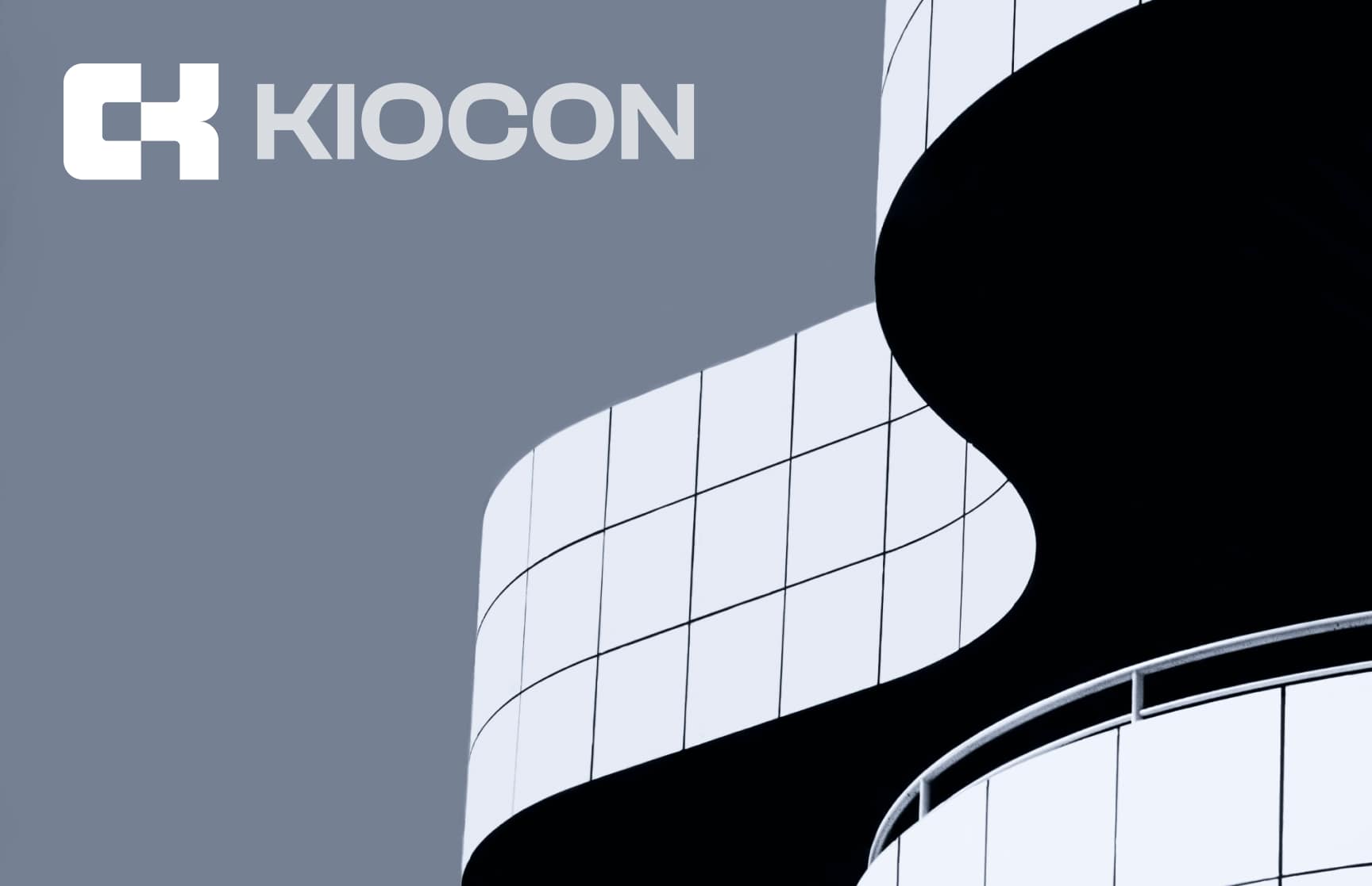
Introduction
Introduction
In the dynamic realm of hardware materials and construction, the creation of KIOCON's brand identity was an artful blend of innovation and symbolism. With a mission to seamlessly integrate the worlds of building constructions and premium hardware materials, the challenge was to distill the essence of KIOCON into a visual representation that resonated with its core values.
In the dynamic realm of hardware materials and construction, the creation of KIOCON's brand identity was an artful blend of innovation and symbolism. With a mission to seamlessly integrate the worlds of building constructions and premium hardware materials, the challenge was to distill the essence of KIOCON into a visual representation that resonated with its core values.
Introduction
In the dynamic realm of hardware materials and construction, the creation of KIOCON's brand identity was an artful blend of innovation and symbolism. With a mission to seamlessly integrate the worlds of building constructions and premium hardware materials, the challenge was to distill the essence of KIOCON into a visual representation that resonated with its core values.
BUILDING
TOMORROW,
TODAY.
BUILDING
TOMORROW,
TODAY.
BUILDING
TOMORROW,
TODAY.
Kiocon is a leading provider of premium hardware materials and comprehensive construction solutions.
Kiocon is a leading provider of premium hardware materials and comprehensive construction solutions.

Conceptualization
Conceptualization
In the dynamic realm of hardware materials and construction, the creation of KIOCON's brand identity was an artful blend of innovation and symbolism. With a mission to seamlessly integrate the worlds of building constructions and premium hardware materials, the challenge was to distill the essence of KIOCON into a visual representation that resonated with its core values.
In the dynamic realm of hardware materials and construction, the creation of KIOCON's brand identity was an artful blend of innovation and symbolism. With a mission to seamlessly integrate the worlds of building constructions and premium hardware materials, the challenge was to distill the essence of KIOCON into a visual representation that resonated with its core values.
Conceptualization
In the dynamic realm of hardware materials and construction, the creation of KIOCON's brand identity was an artful blend of innovation and symbolism. With a mission to seamlessly integrate the worlds of building constructions and premium hardware materials, the challenge was to distill the essence of KIOCON into a visual representation that resonated with its core values.

Symbolism of Pipes
Symbolism of Pipes
Symbolism of Pipes: The choice of pipes as the central element in the logo was deliberate. They serve as a universal symbol for construction and are integral to the hardware materials KIOCON offers. The interplay of pipes in the logo reflects the interconnectedness of various construction elements, emphasizing KIOCON's holistic approach to building solutions.
The choice of pipes as the central element in the logo was deliberate. They serve as a universal symbol for construction and are integral to the hardware materials KIOCON offers. The interplay of pipes in the logo reflects the interconnectedness of various construction elements, emphasizing KIOCON's holistic approach to building solutions.
Symbolism of Pipes
Symbolism of Pipes: The choice of pipes as the central element in the logo was deliberate. They serve as a universal symbol for construction and are integral to the hardware materials KIOCON offers. The interplay of pipes in the logo reflects the interconnectedness of various construction elements, emphasizing KIOCON's holistic approach to building solutions.

Color Palette
Color Palette
The chosen color palette of red and black was intentional. Red, representing energy, passion, and the dynamic nature of construction, while black conveyed trust, reliability, and the strength of KIOCON's commitment to quality.
The chosen color palette of red and black was intentional. Red, representing energy, passion, and the dynamic nature of construction, while black conveyed trust, reliability, and the strength of KIOCON's commitment to quality.
Color Palette
The chosen color palette of red and black was intentional. Red, representing energy, passion, and the dynamic nature of construction, while black conveyed trust, reliability, and the strength of KIOCON's commitment to quality.
Adaptability
Adaptability
A key consideration was ensuring the logo's adaptability across various mediums. Whether on a website, product packaging, or promotional material, the logo maintains its integrity and impact.
A key consideration was ensuring the logo's adaptability across various mediums. Whether on a website, product packaging, or promotional material, the logo maintains its integrity and impact.
Adaptability
A key consideration was ensuring the logo's adaptability across various mediums. Whether on a website, product packaging, or promotional material, the logo maintains its integrity and impact.


Outcome
Outcome
The finalized logo achieved the desired blend of professionalism, innovation, and reliability. It served as a visual representation of KIOCON's commitment to quality hardware materials and construction excellence. The Clash Display typeface added a contemporary edge, ensuring that the logo stands out in a competitive market.
The finalized logo achieved the desired blend of professionalism, innovation, and reliability. It served as a visual representation of KIOCON's commitment to quality hardware materials and construction excellence. The Clash Display typeface added a contemporary edge, ensuring that the logo stands out in a competitive market.
Outcome
The finalized logo achieved the desired blend of professionalism, innovation, and reliability. It served as a visual representation of KIOCON's commitment to quality hardware materials and construction excellence. The Clash Display typeface added a contemporary edge, ensuring that the logo stands out in a competitive market.


Are you looking for a visual design expert or a no-code developer for your next project? Let's talk!
Are you looking for a visual design expert or a no-code developer for your next project? Let's talk!
Are you looking for a visual design expert or a no-code developer for your next project? Let's talk!
muthukumar.uxdesigner@gmail.com
muthukumar.uxdesigner@gmail.com
Mobile
Mobile
Mobile
+91 88618 68519
+91 88618 68519
© 2023, Muthukumar M
© 2023, Muthukumar M
© 2023, Muthukumar M