
Designing a wallet-based salary experience for underserved workforces
Company
Happay
Role
UX UI Designer
Industry
Fintech
Scope
Mobile App
SUMMARY
Happay Payroll was designed to help businesses disburse salaries directly into employee wallets, reducing dependence on traditional bank accounts and making salary access faster for blue-collar and SME workforces across India.
I worked on the mobile experience for employees across onboarding, salary receipt, wallet access, card controls, and transaction visibility. The goal was to make payroll feel immediate, trustworthy, and easy to use—even for people using a financial app for the first time.
The problem
For many workers in India, receiving a salary through the formal banking system is still full of friction.
Opening salary accounts can be slow and document-heavy. Employers deal with operational overhead. Employees often face delays, limited access to funds, and low confidence in digital financial systems. For users with low digital literacy, even basic financial tasks can feel intimidating.
That meant the challenge was bigger than payroll processing.
It was about designing a product that could turn salary access into a simpler, more direct experience—without depending on traditional banking behavior.
The opportunity
The product created an opportunity to rethink payroll as a wallet-based experience instead of a bank-account-first one.
Instead of asking every employee to navigate the complexity of salary accounts, the platform could help businesses disburse money directly into an employee wallet, while giving the employee simple tools to:
receive salary instantly,
access funds through a prepaid card,
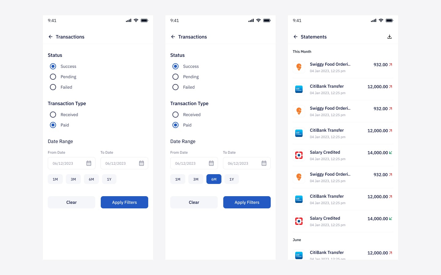
track transactions clearly,
and control card usage with confidence.
The real design challenge was not adding features.
It was making financial control feel understandable and trustworthy for first-time users.
MY ROLE
I worked as a UX/UI Designer on the product, collaborating with product managers and the design lead.
My responsibility was to design the mobile employee experience across:
visual and interaction design,
high-fidelity UI,
prototyping,
and system-level consistency across the app.
I translated product requirements and UX direction into polished, launch-ready mobile flows for iOS and Android.
My approach
Design for two realities
The product sat between employer efficiency and employee usability. Businesses needed smooth salary disbursals, but the employee-facing app had to be simple enough for users with limited financial app experience.
That meant every design decision had to reduce confusion, not just support functionality.
Reduce effort at every stage
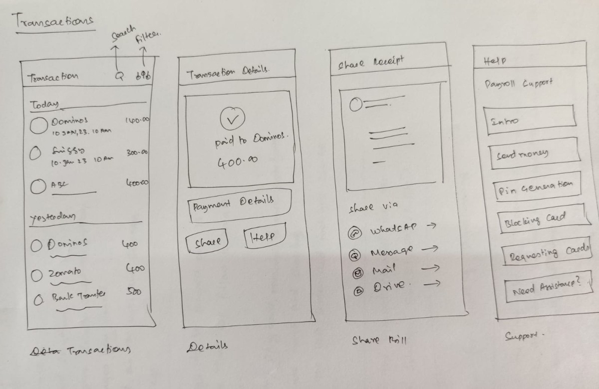
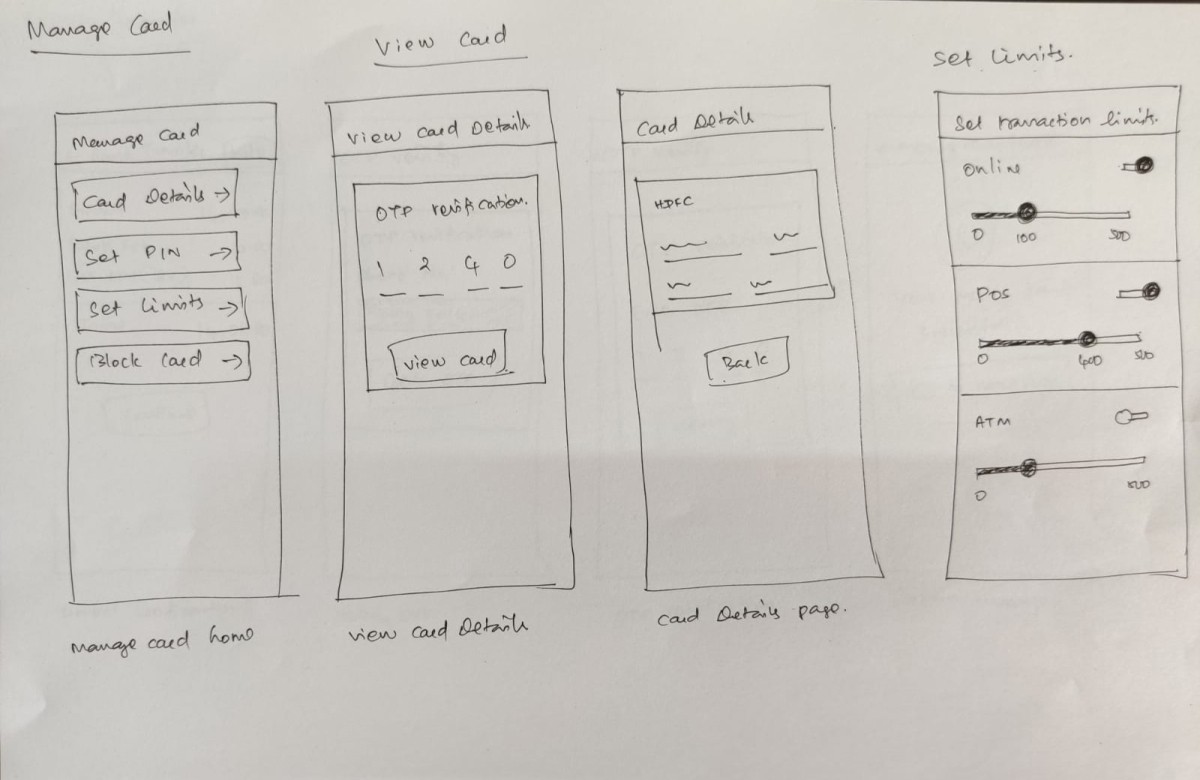
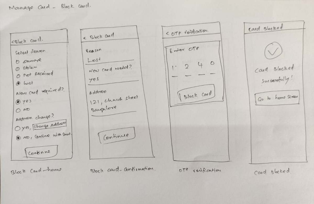
We explored low-fidelity flows first and iterated on the structure before moving into polished UI. The priority was to keep every journey short and legible, especially for users who might drop off if the app felt too dense or technical.
Design for trust, not just usability
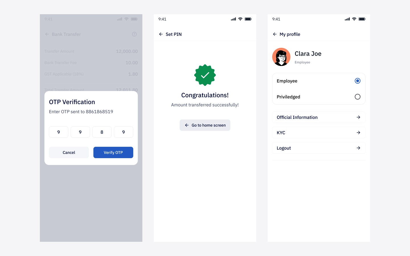
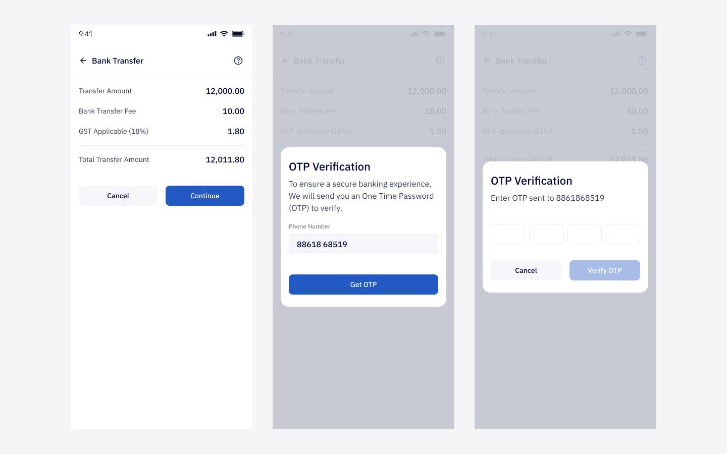
Because the product handled salary, clarity was essential. I paid close attention to confirmation states, status communication, transaction visibility, and control surfaces so users always felt informed about where their money was and what actions they were taking.
The solution
I designed the app around three simple pillars:
Receive
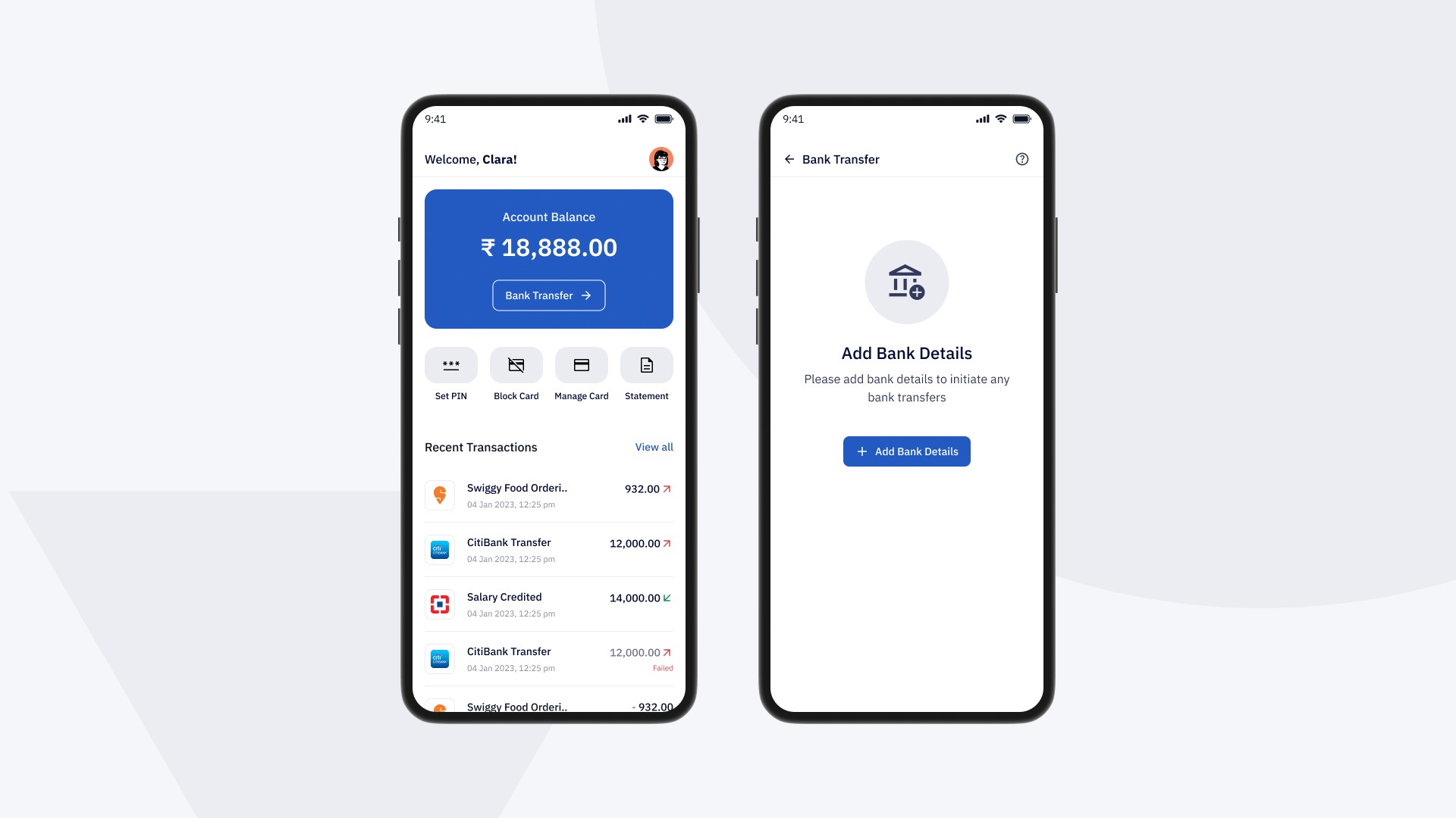
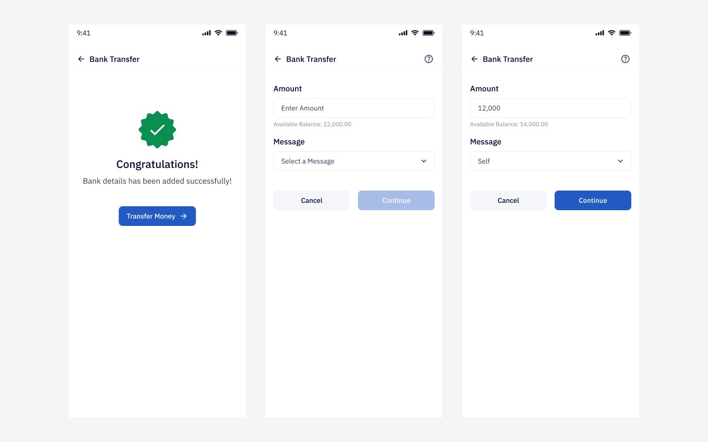
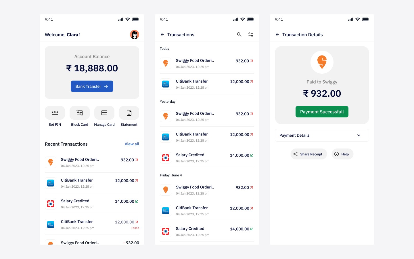
Employees could receive salaries directly into their in-app wallet with clear notifications and immediate visibility into credited funds.
Spend
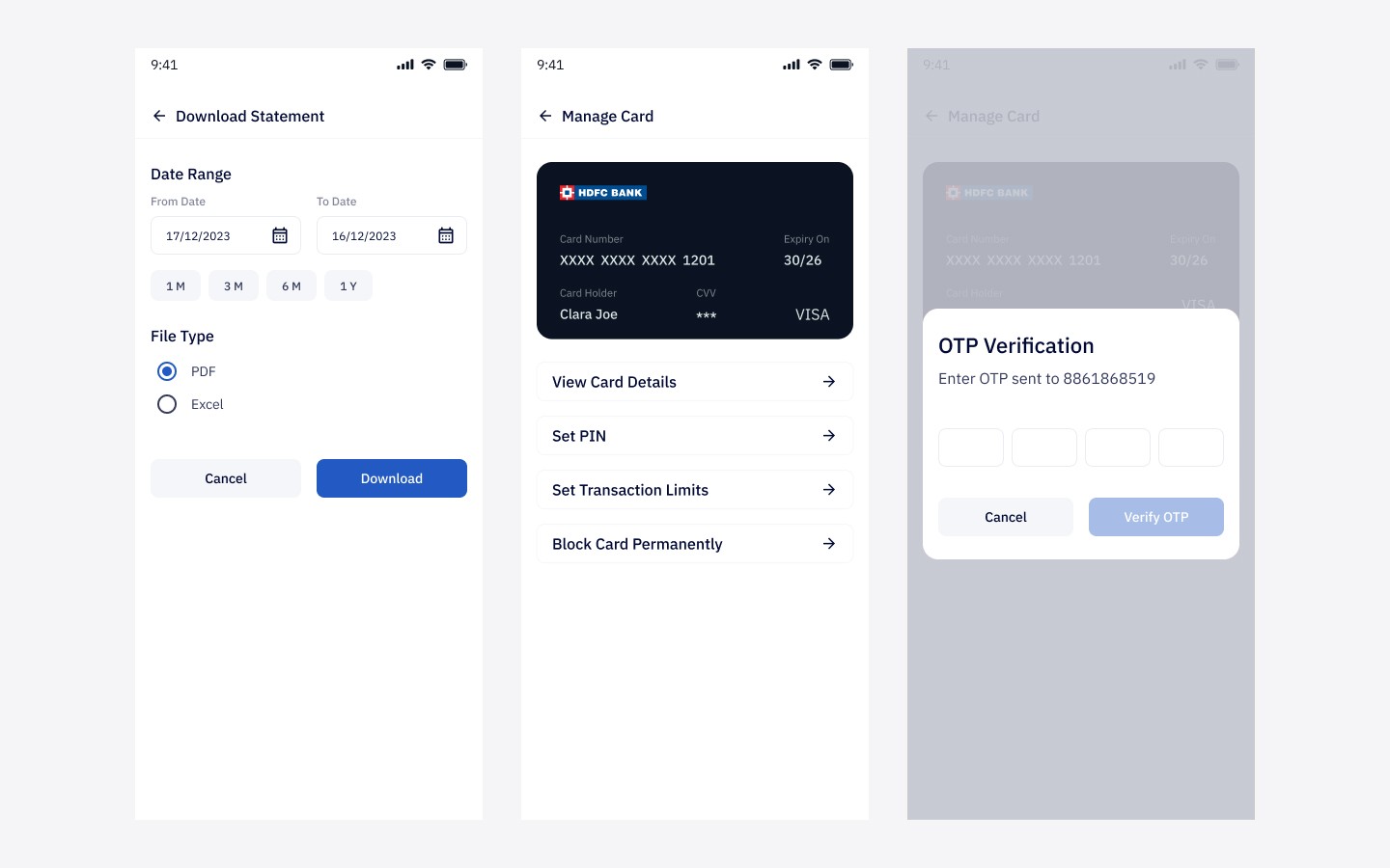
A linked prepaid card allowed users to access money through ATM withdrawals, POS payments, and online transactions without needing a traditional salary account.
Control
Users could manage their card settings, view transactions, lock or unlock access, and understand how their money was being used—all from within the app.
This made the product feel less like a technical payroll utility and more like a practical financial access tool.
Information Architecture

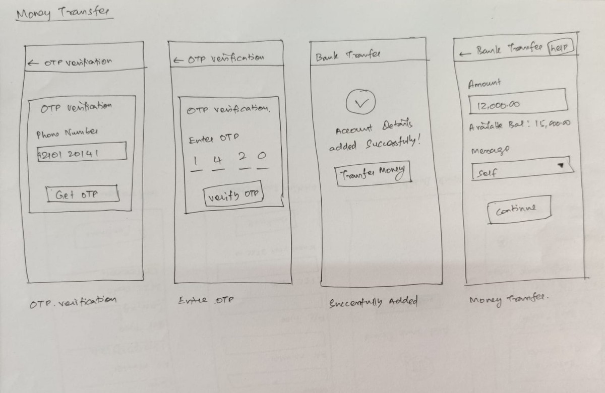
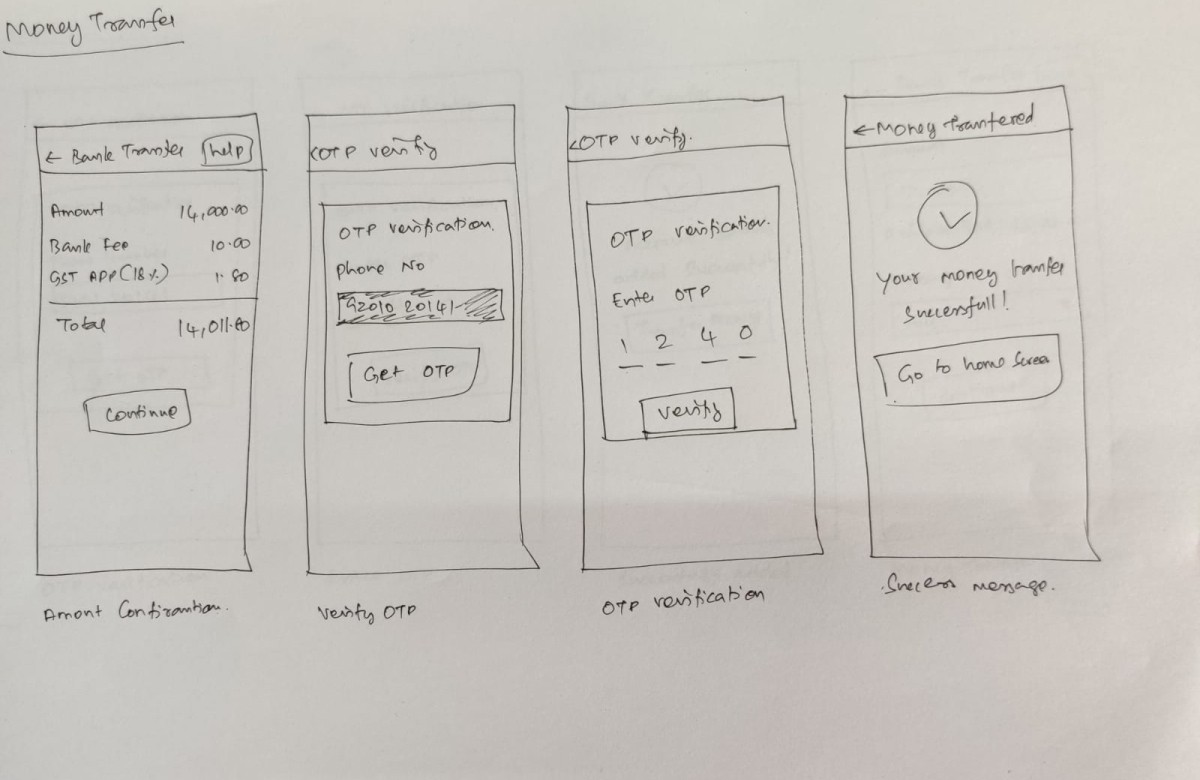
Initial sketches


Key design decisions
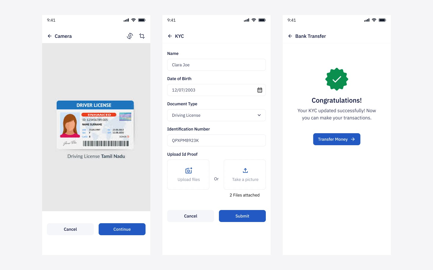
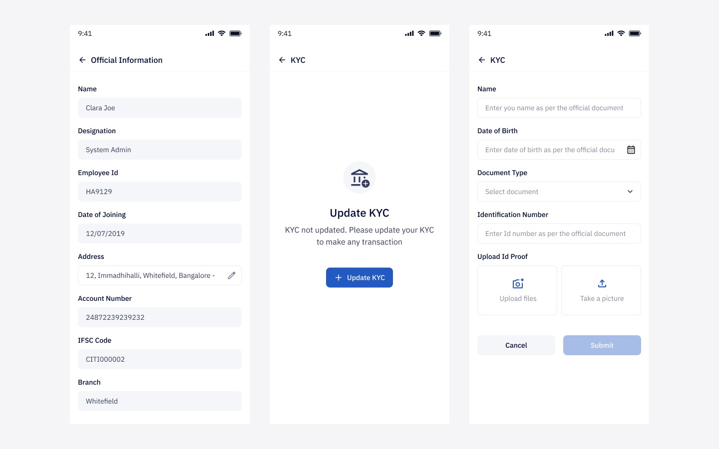
Design for first-time financial app users
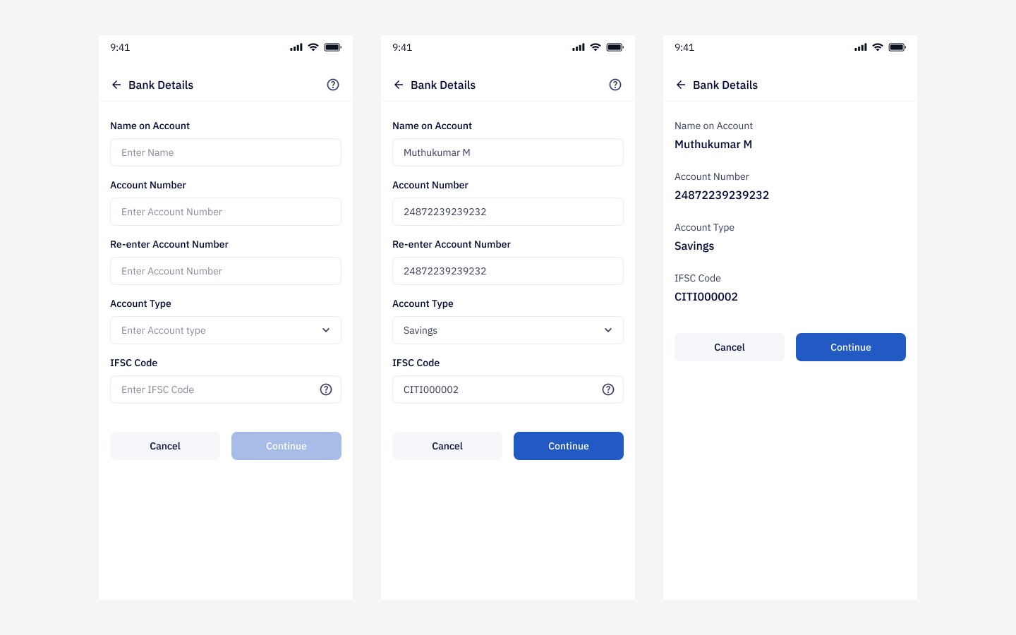
Most fintech apps assume confidence and familiarity. This product could not. I designed with larger touch targets, simpler structure, strong hierarchy, and clear step-by-step flows so the experience stayed approachable.
Make salary visibility immediate
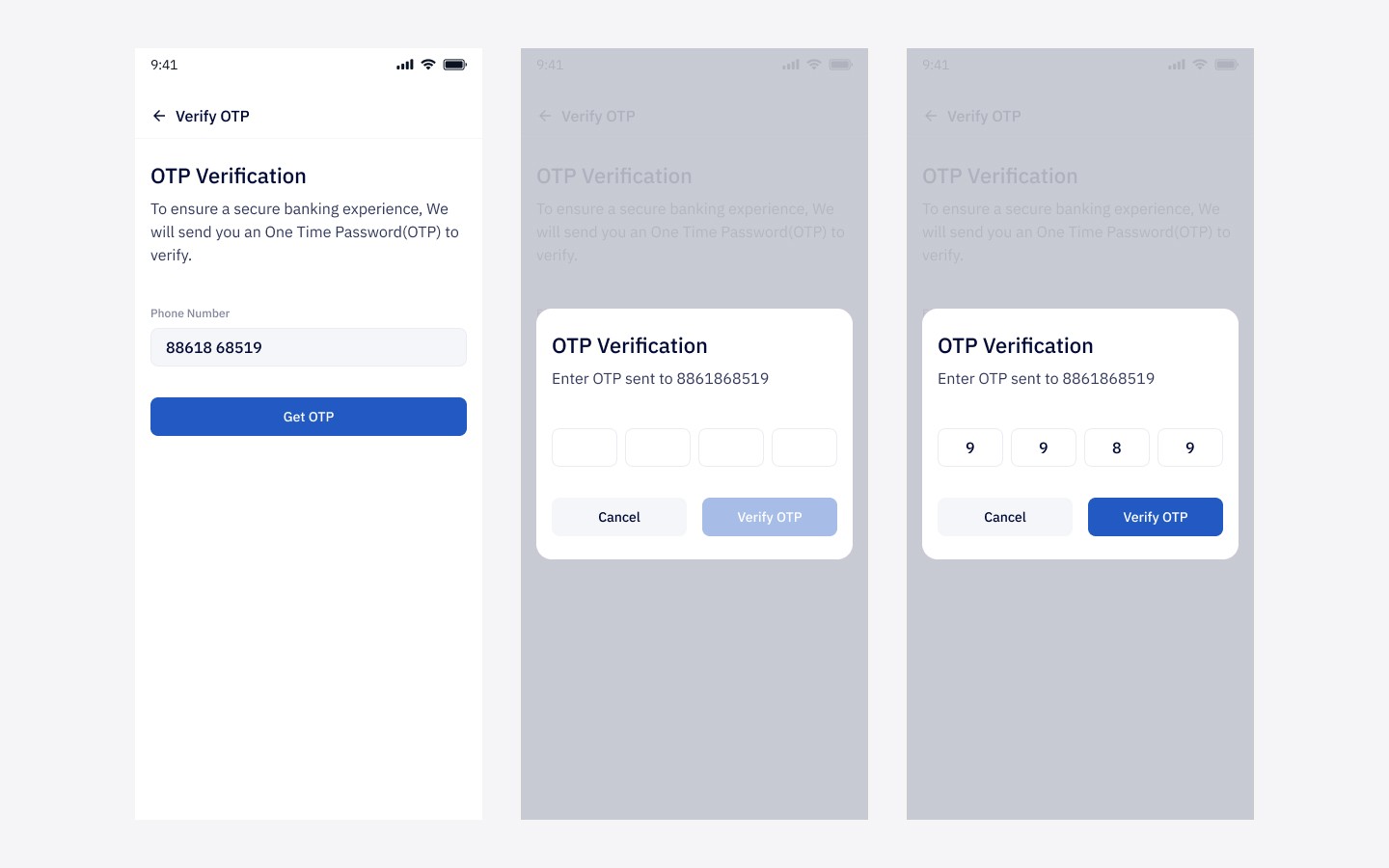
One of the most important emotional moments in the app was salary receipt. I designed that moment to feel clear and reassuring through strong status communication, visible balances, and direct transaction confirmation.
Treat card controls as a core experience
Card management was not handled like a secondary settings screen. It was designed as a central part of the product because control builds trust. Giving users the ability to lock, unlock, and manage card usage made the product feel more empowering.
Build trust through transparency
For users unfamiliar with digital wallets, ambiguity can feel risky. I focused on clear transaction records, readable balance states, and confirmation-driven interactions to reduce uncertainty and make the system feel dependable.
Stay consistent with the broader product ecosystem
Since Happay already had a larger enterprise product suite, I aligned the Payroll experience with the company’s broader visual language and patterns so it felt connected rather than isolated.
Final UI screens


Outcome
The app shipped as part of Happay’s enterprise payroll offering and supported a broader shift away from cash-based or manually managed salary workflows.
For me, the most important outcome was not just shipping screens. It was contributing to a product that made formal financial access feel simpler for users who are often underserved by default banking experiences.